
Why you need to learn Tableau basics:
Learn Tableau for business intelligence, data visualization, and dashboard creation.

Business intelligence software helps organization make better decisions. By providing good visualization dashboards, they make it easier to:
- see relationships in data.
- tell a clear story.
- keep the focus on the metrics that matter.
Tableau and Microsoft Power BI are the leading products in the data visualization and business intelligence software space. Tableau in August 2019 sold to SalesForce for $15.7 Billion. Apparently there’s a lot of value in making it easier for companies to visualize their data.

Tableau is in demand. My previous analysis on the Comparison between Different languages | Data science showed that Tableau was the eighth most commonly listed technology skill in data scientist job listings.

Tableau is the easiest technology on this list to quickly become proficient with — assuming you already know Excel. With Tableau, you can make impressive visualizations quickly. It’s fun and easy to use.
let’s look at the most important things to know when starting out with Tableau to set you up for success. I’ll demonstrate with a dataset of New Belgium Brewing beer ratings that we scraped from Beer Advocate.
Top 10 Things to Know about Tableau
- It’s pretty much all drag and drop. You might occasionally need to enter an advanced calculation, but generally, just drag and drop.
 |
| Drag and drop |
- You import data in the Data Source tab. Drag and drop data sources to join or union them. Tableau has connectors for almost any data source you can think of.
 |
| Some Tableau Connector Options |
- You do most of your work in worksheets. Each worksheet is in a tab at the bottom of the window, like in a spreadsheet program, Drag variables from the left side Data bar to Rows and Columns Fields at the top of the sheet.
 |
| Dragging variables to Rows |
- The view is the main visualization area of the worksheet. You can also drag variables to the view or the Marks card so they show up in the view.
- Tableau tries to be helpful. It infers the type of data based on a column’s contents. It provides helpful little symbols next to each variable name to represent numeric, string, geo, boolean, and date data types. Tableau splits your data columns into dimensions and measures.
 |
| Dimensions and measures |
Dimensions are qualitative (categorical) variables—they include strings and dates. They are discrete, by default. Discrete variables are colored blue.
Measures are quantitative (numeric) variables that you can sum and average. They are continuous, by default. Continuous variables are colored green.
Tableau will assume you want to sum measures any time you use them, by default. You can change the aggregation function with a right click on that variable.
 |
| Changing the aggregation function |
- The Marks card controls many visualization aspects. Drag variables from the left side bar to the Marks card to control color, text, tooltips, and more. Use it after your rows and columns are set.
 |
| Make the size of the bars based on the number of ratings |
- There are many chart options — Tableau makes suggestions in the expandable Show Me menu to the right. Suggestions are based on the current variables used in the worksheet.
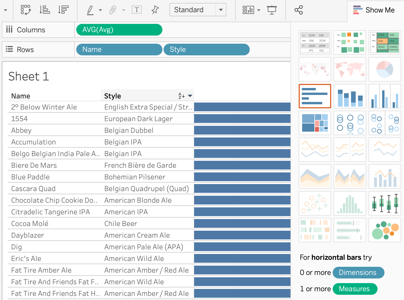 |
| Show Me menu of visualizations Know that if you click on a chart option, Tableau might rearrange the variables in your worksheet.
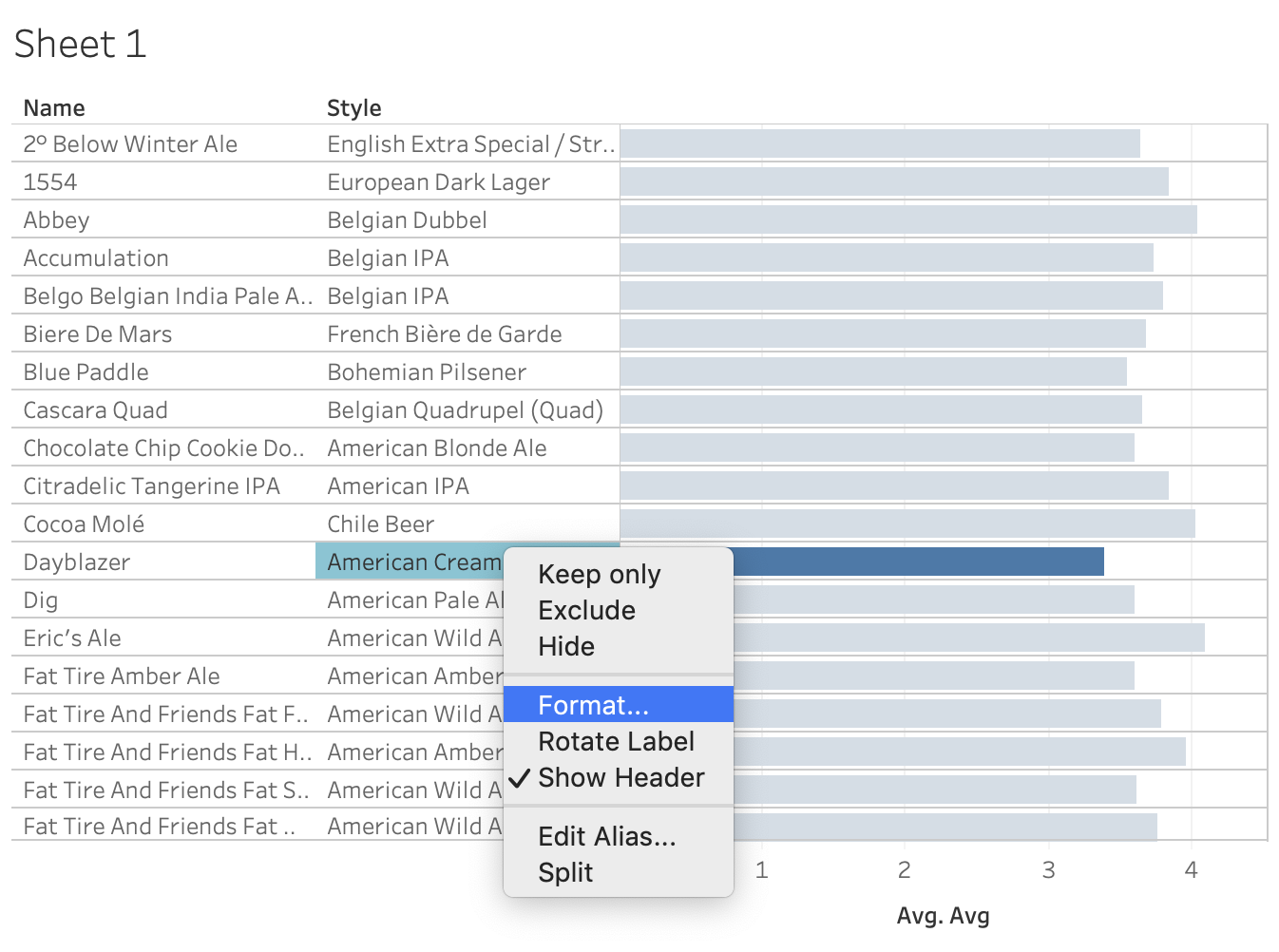 Format most anything with a right click
 Filtering process Isn't it cool?
 Create more things!
 Dashboard by Tableau ConclusionTableau is great for creating spiffy dashboards with visualizations quickly. Tableau isn’t great for machine learning. You can get a trends line that will show you an R2. But anything else will take to roller coasting. You can play with Tableau Public for free, but creating data visualization with private data will require Tableau Desktop. And that will cost you $70 a month as of June 2022. Both Tableau products are downloadable programs for MacOS and Windows. I suggest you download Tableau Public and play with it. You can muck around by dragging and dropping — and liberal use of the undo button. However, it’s nice to know what you’re doing and to be able to make changes quickly. Hopefully this guide has whet your appetite to learn more. Happy Tableauing!𝕿𝖍𝖆𝖓𝖐𝖘 & 𝕽𝖊𝖌𝖆𝖗𝖉𝖘... |
0 comments:
Post a Comment